


Introduction
UX design methodology is simply how great digital experiences get built. Ensuring that what you provide genuinely makes sense to the user is the key. Its main objective is to comprehend your audience and then create something easy for them to use.
This procedure has a defined structure and is not based on conjecture. You start by listening. What do users need? What’s getting in their way? Once you’ve got real insight, then comes the planning, sketching, testing, and refining. Every step is about solving a problem, not decorating a page.
And here’s the truth: great UX doesn’t just happen in design tools. It’s shaped through research, feedback, and collaboration across teams. Product, dev, marketing, support, everyone plays a part in making sure the result works.
In this blog, I’ll break down each step of the UX design methodology in plain terms. If you’re building anything digital, this is the process that helps you get it right, not just for you, but for your users too.
Key Phases of UX Design Methodology
1. User Research For UX Design Methodology
User research is the starting line for any smart UX design process. If you’re designing without talking to users first, you’re working off assumptions, and that rarely ends well. Research helps you step into the shoes of your users so you can design with purpose, not just preference.
At this stage, it’s all about gathering raw insight. You’re not trying to solve the problem yet, you’re just learning what the real problem is.
Below is the stepwise process for the UX Design Methodology:
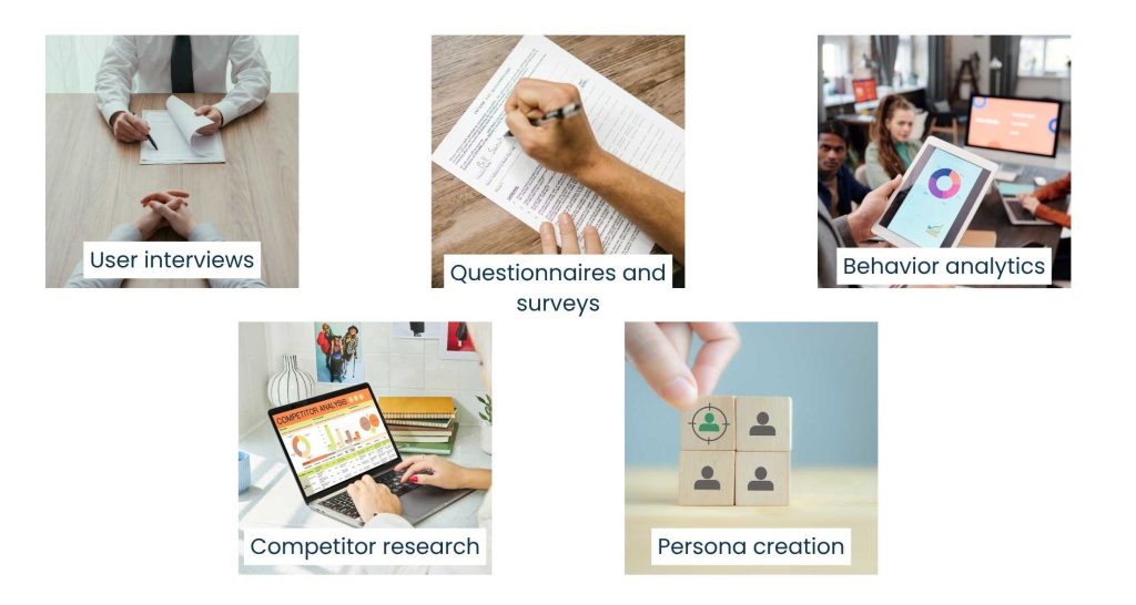
1. User interviews
One-on-one conversations with real users provide rich and detailed stories. You’ll hear what they struggle with, what they like, and what they hate in current tools or processes.
2. Questionnaires and surveys
When you require input from a larger group of people, these are effective. Consider it a means of verifying patterns or identifying trends in people’s thoughts or actions.
3. Behavior analytics
You may analyze how users interact with your website or product with the use of technologies like Google Analytics or Hotjar. You can see the pages they spend time on, what they click, and where they leave off.
4. Competitor research
Looking at what others are doing, good or bad, gives you a clearer picture of what users already expect, and if there’s some space for improvement.
5. Persona creation
Once you’ve collected enough insight, you start to see user types emerge. You could have a “Busy CEO,” “First-Time User,” or “Power Admin.” These characters guide you to design with actual individuals, not averages.
Understanding, not data for the sake of data, is what you want to go for here. Properly conducted research will lead you directly to the most crucial elements: what your users require, why they require it, and how they would like it to operate.
Additionally, the rest of the design process becomes a lot more focused and less hazardous when you have that clarity from the beginning.
2. Define the Problem For UX Design Methodology
Once you’ve completed your research, the next step is to pause and make it sound sensible. This is where clarity begins.
Now you are defining the problem and not designing anything. It is a waste of time to skip this step and go straight to wireframes. By bringing up the obvious issue, everyone stays on the same page and can concentrate on what is important.
Here’s how UX Design Methodology plays out in action:
1. Find the underlying pain points
Don’t listen to complaints at face value. If customers complain that “The app is confusing,” then drill down and ask why. Is it the navigation? For imprecise terminology, keep digging until you reach the underlying issue.
2. Draft a clear problem statement
Something like: “Users cannot finish checking out because the form has too many fields that are not needed, and no validation of errors.” This guides the design team.
3. Align with business objectives
What do you wish to happen as a result of this problem being solved? Improved conversion? Increased engagement? The sweet spot is where user needs intersect with business goals.
4. Ask “How Might We…” questions
These open-ended questions prompt your brain to enter solution mode without committing you. For instance: “How could we make the form easier to fill out and still get the information that matters?”
It’s all about attention during this step. If the entire team is aligned on the problem, they can bring forward improved ideas and prevent design meanders. It also provides you with a lens through which to measure your solutions afterwards; if it doesn’t address this problem, it’s not the correct solution.
3. Information Architecture For UX Design Methodology
After defining the problem, it’s time to impose order on chaos. That’s where Information Architecture (IA) steps in. IA is all about arranging features and content such that everybody, not just those who are building them, can understand them.
Even a beautiful design won’t work if users can’t find what they’re looking for or aren’t sure how to proceed. IA makes your product intuitively navigable from the very first click.
This is what teams do for this stage:
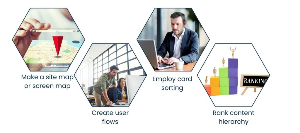
1. Make a site map or screen map
It’s a diagram of all the main sections, sub-sections, and primary screens in your product. It identifies unnecessary complexity and keeps navigation uncomplicated.
2. Create user flows
To accomplish a task, such as resetting a password or scheduling an appointment, a user flow sketches out the process that a user goes through. It ensures every step is natural and frictionless.
3. Employ card sorting
This user research technique is about having users sort and categorize content as they would expect to find it. It’s amazingly helpful when creating menus or dashboards.
4. Rank content hierarchy
Not everything on the page requires the same level of attention. IA also involves determining what users need to see first, what can be positioned lower on the page, and what can be organized or collapsed.
Having IA correct isn’t glamorous, but it makes everything else easier. It creates the foundation for design, navigation, and usability, and it quietly dictates the extent to which users feel comfortable as they navigate your product.
4. Wireframing and Prototyping in UX Design Methodology
It’s time to sketch up your structure now that you’ve outlined it. You may see things before you write a single line of code by using wireframing and prototyping. It’s more like drafting a blueprint of a design before finishing it.
This stage is more about layout, flow, and interaction than it is about branding or colors.
Here’s how UX Design Methodology works:
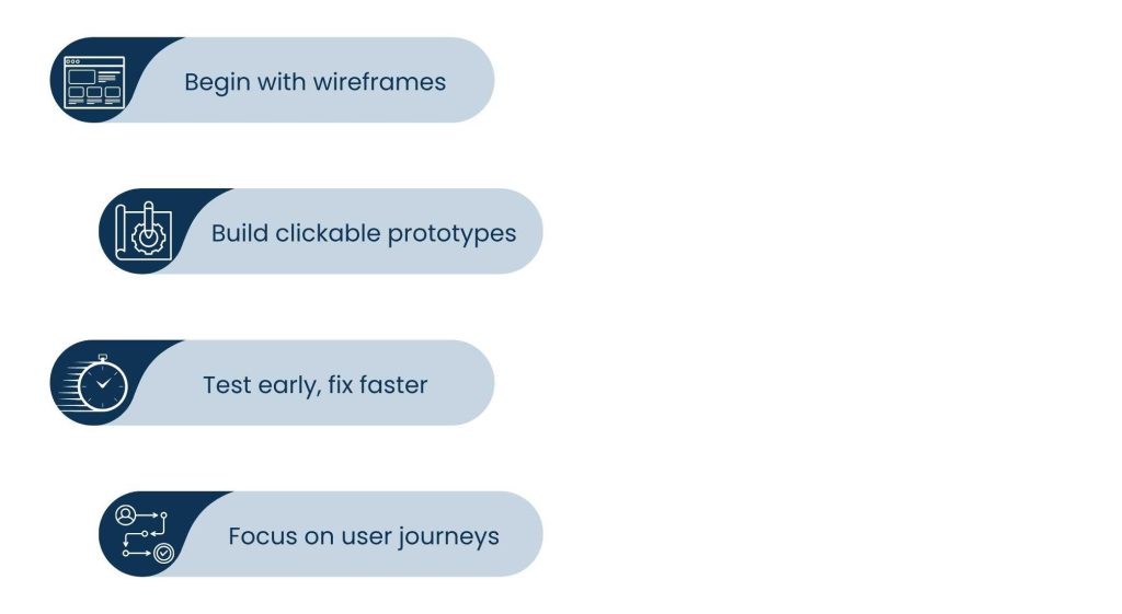
1. Begin with wireframes
These straightforward black-and-white patterns make it clear what belongs where. For instance, a webpage wireframe would have a header, a hero section, feature boxes, and a footer, but no text styling or graphics. You can use Sketch, Figma, or simply paper and ink.
2. Build clickable prototypes
After the wireframes are solid, you can connect them into a clickable, simple model. This provides stakeholders and users with a sense of how the product is going to behave, but without involving a developer at this point.
3. Test early, fix faster
These prototypes should be examined, clicked through, and tested. If something is confusing or awkward, now’s the time to make it right. To iterate, here is a quick and inexpensive.
4. Focus on user journeys
Always create wireframes focusing on the end goals. Ensuring seamless experiences for signing up, purchasing, or scheduling a call.
Prototypes and wireframes give your team a solid basis to react to. By giving concepts a physical form, they enable testing, removing ambiguity, and reducing the need for costly revisions later o
5. Usability Testing for UX Design Methodology
You’ve mapped it, designed it, and built a prototype. Now it’s time to step back and ask the one group that matters most—the users. You have the opportunity to verify the design through usability testing before launch. Observing what consumers do is more important than speculating about what they might do. And trust me, they’ll always surprise you.

Here’s how usability testing usually plays out for UX Design Methodology:
1. Set clear goals
Don’t test everything at once. Focus on specific user tasks like “Can they find the pricing page?” or “Can they complete a checkout without errors?”
2. Choose your users wisely
Aim for a small, diverse group that reflects your real audience. You don’t need 50 testers—five solid participants often reveal 80% of major issues.
3. Let them explore naturally
Don’t guide too much. Give them a goal and observe. Where do they hesitate? Where do they click instinctively? These moments reveal design friction.
4. Collect feedback and behavior
Combine observations with direct feedback. Ask what confused them, what felt smooth, and what could be better.
5. Adjust the design in light of your new knowledge.
Improving the design is the goal of this step, not defending it. Repeat the step rapidly by applying what you’ve learned.
Testing for usability maintains the attention on the users of your product, where it belongs. Early pain point identification saves money, effort, and the hassle of redesigning after launch.
6. UI Design and Visual Identity: Where Function Meets Feel
It’s time to add visual components after you’ve improved the product’s flow and layout through iterations. Color, font, icons, padding, and graphics are all examples of UI design (User Interface), which is essentially everything that gives your product a polished appearance and is consistent with your brand.
There is more to this phase than appearances, though. Excellent UI improves usability.
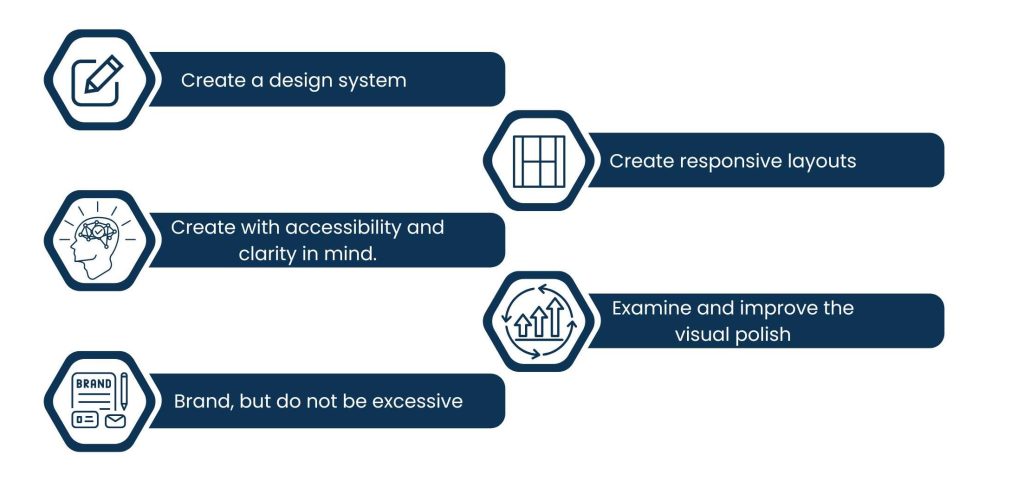
1. Create a design system
A solid UI starts with consistency. You will create a style guide that specifies iconography, button styles, fonts, colors, and spacing guidelines. This keeps everything consistent across screens and websites.
2. Create with accessibility and clarity in mind.
Every visual component should speed up users’ comprehension of information or persuade them to take action. Good contrast, readable fonts, and logical spacing make a huge difference.
3. Brand, but do not be excessive.
We should not sacrifice usability in favor of brand design. Without detracting from the experience, subtle branding components like tone, color scheme, and logo can enhance it.
4. Create responsive layouts.
Surfing is always different. Your user interface should function well on phones, tablets, laptops, and large screens without sacrificing usefulness or style.
5. Examine and improve the visual polish.
Small. Things. Such as. Alignment, padding, and hover effects—they look little but contribute greatly to user opinion.
Good UI design makes your product feel deliberate. Users don’t realize the interface; they know it feels like it ought to when it’s done correctly.
7. Implementation Handoff + Post-Launch Evaluation
When the UI is complete, it’s time to switch from design to implementation. But here’s the thing: the handoff isn’t a handover. It’s a team effort.
A smooth handover of implementation assures that developers can do everything they need to create what was designed—no guesswork or redoing.

The following makes that handover so effective for UX Design Methodology:
1. Share files ready for developers
Employ tools such as Figma’s Dev Mode, Zeplin, or Storybook to share assets, dimensions, and notes about interactions in one location.
2. Clarify interaction behaviors
Micro-interactions, transitions, and hover states need to be documented. What occurs when someone clicks here? What is the error state?
3. Be on hand for clarification
There will be questions. Designers and developers must be in touch during this process to prevent expensive misunderstandings.
But once it’s built and deployed, your work isn’t over.
That’s where post-launch evaluation comes in:
1. Watch real-world usage
Use tools like Mixpanel, Hotjar, or Google Analytics to see what users are doing instead of what you planned them to do.
2. Gather feedback
Search for patterns in support tickets, reviews, or direct user feedback. These are your goldmines for future optimizations.
3. Iterate on purpose
UX is never done. Each launch is merely a new iteration. Make use of the knowledge you gain to improve it in the future.
From the last handoff to feedback loops, this final leg is what transforms an excellent product into a phenomenal one, because actual users will always indicate to you what needs improvement next.
Conclusion
UX design is an interface problem-solving process, not merely a design discipline. With a process-focused UX Design Methodology, your team is on a predetermined path from insight to delivery. You’re not relying on guessing or assuming users will “get it.” You’re designing on purpose, backed by real data and people’s opinions.
Each step from research to post-launch is for a reason. You find real needs, define pertinent problems, structure content, and test before it’s too late to fix. You develop concepts in wireframes, polish them in UI, and present them with brevity. And even post-launch, you still listen and learn.
The advantage of the UX Design Methodology is that it is flexible, repeatable, and collaborative. This approach follows your goals, whether you’re developing an enterprise application, marketing site, or mobile application.
Good UX Design Methodology is the result of deep people’s understanding, not technology or design trends. And when you do it first, your product is something that people not only like but come back to again and again.
About Us
Tasks Expert offers top-tier virtual assistant services from highly skilled professionals based in India. Our VAs handle a wide range of tasks, from part time personal assistant to specialized services like remote it support services, professional bookkeeping service etc. Furthermore, it helps businesses worldwide streamline operations and boost productivity.
Ready to elevate your business? Book a Call and let Tasks Expert take care of the rest.

About Author

Gary Katz
Related Blogs